Creative Artworker
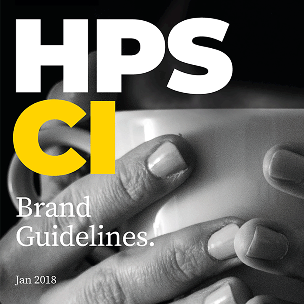
HPS BRANDING AND STATIONERY
Brief
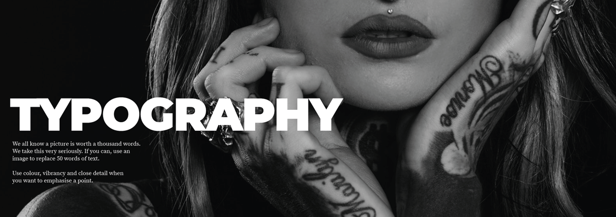
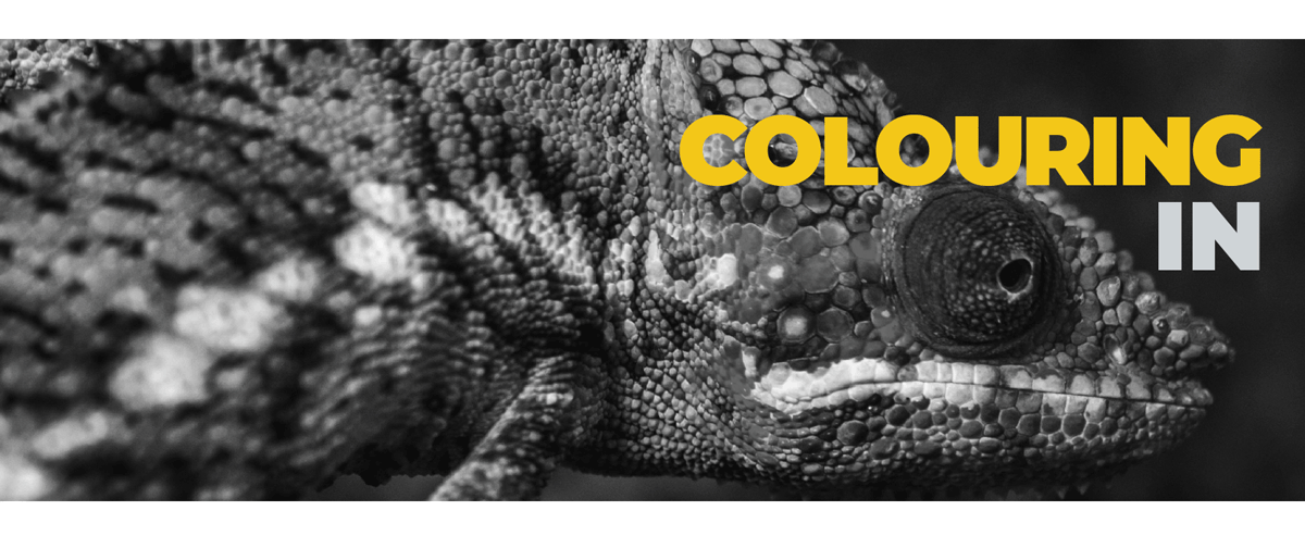
The new HPS branding was born from an image of an evocative tattooed lady. There was no brief as such ‐ it was more an evolution, a need for a more 'grown-up' approach to update the look and feel of the existing logo
Solution
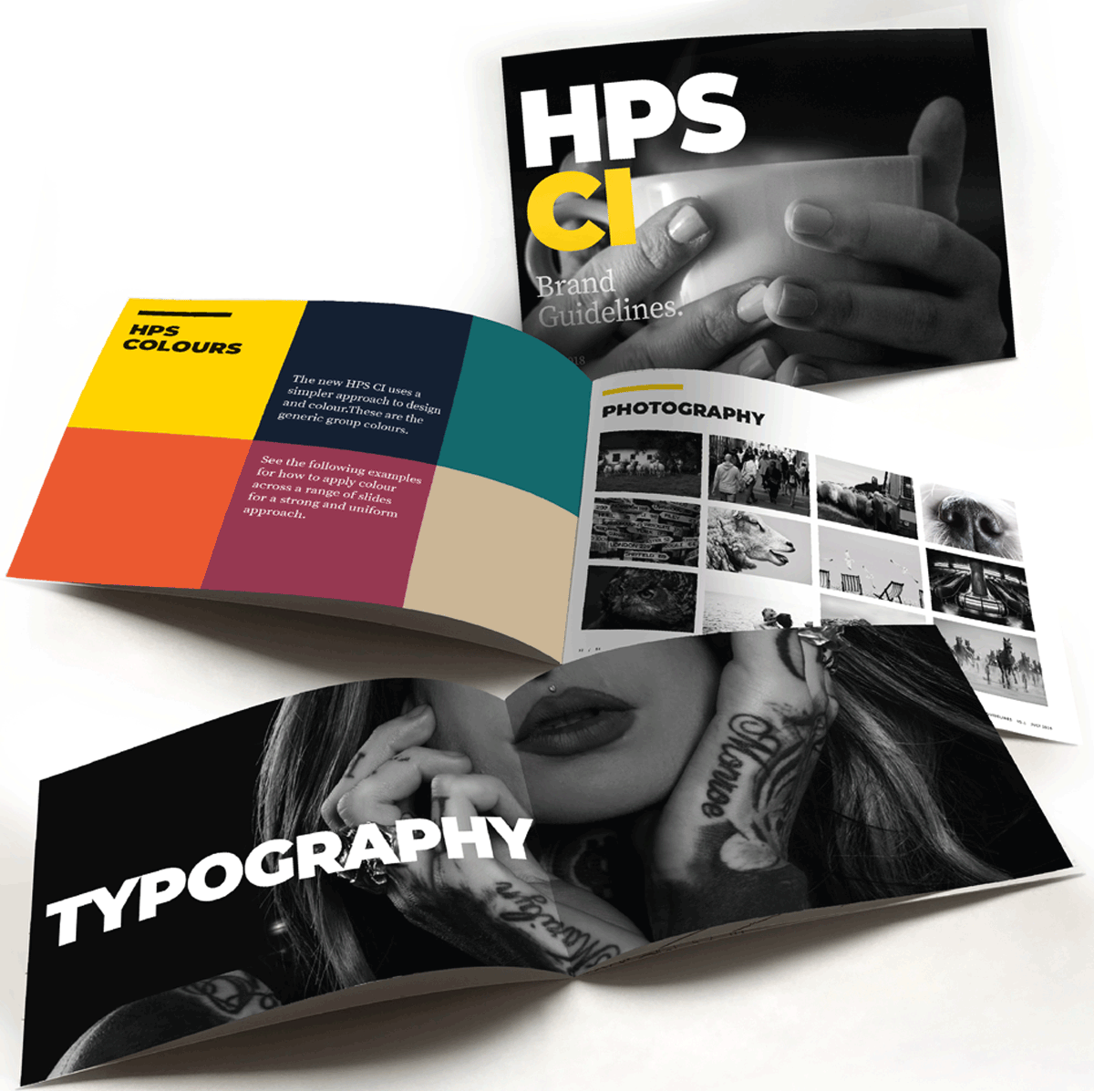
We created a fresh new logo and revamped the fonts and typography to make a bold statement. We chose new imagery, using image filters to create a consistent and uniform mono finish. The logo's new voice was short, simple and direct, ensuring effective communication of the boldness of the HPS brand.
My contribution
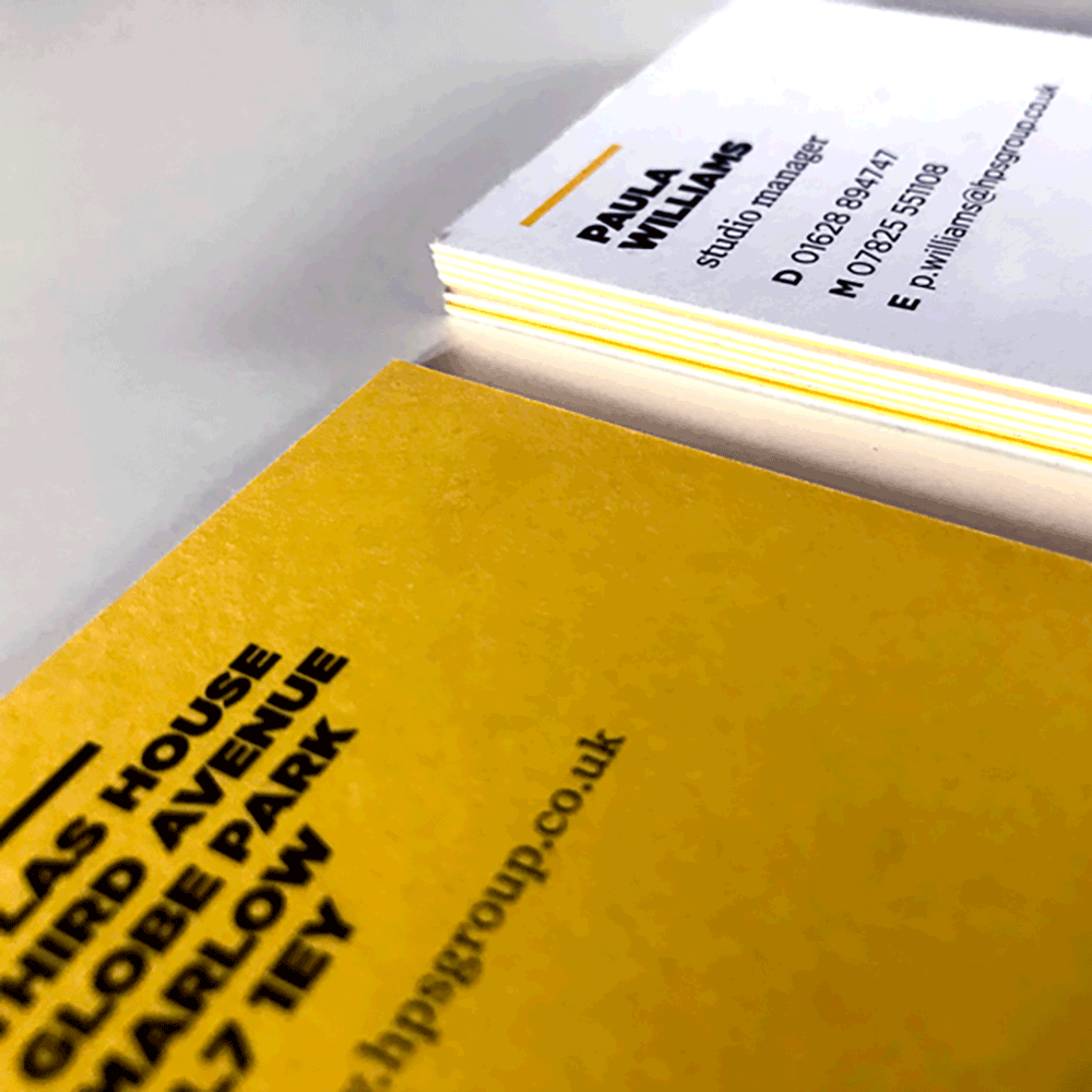
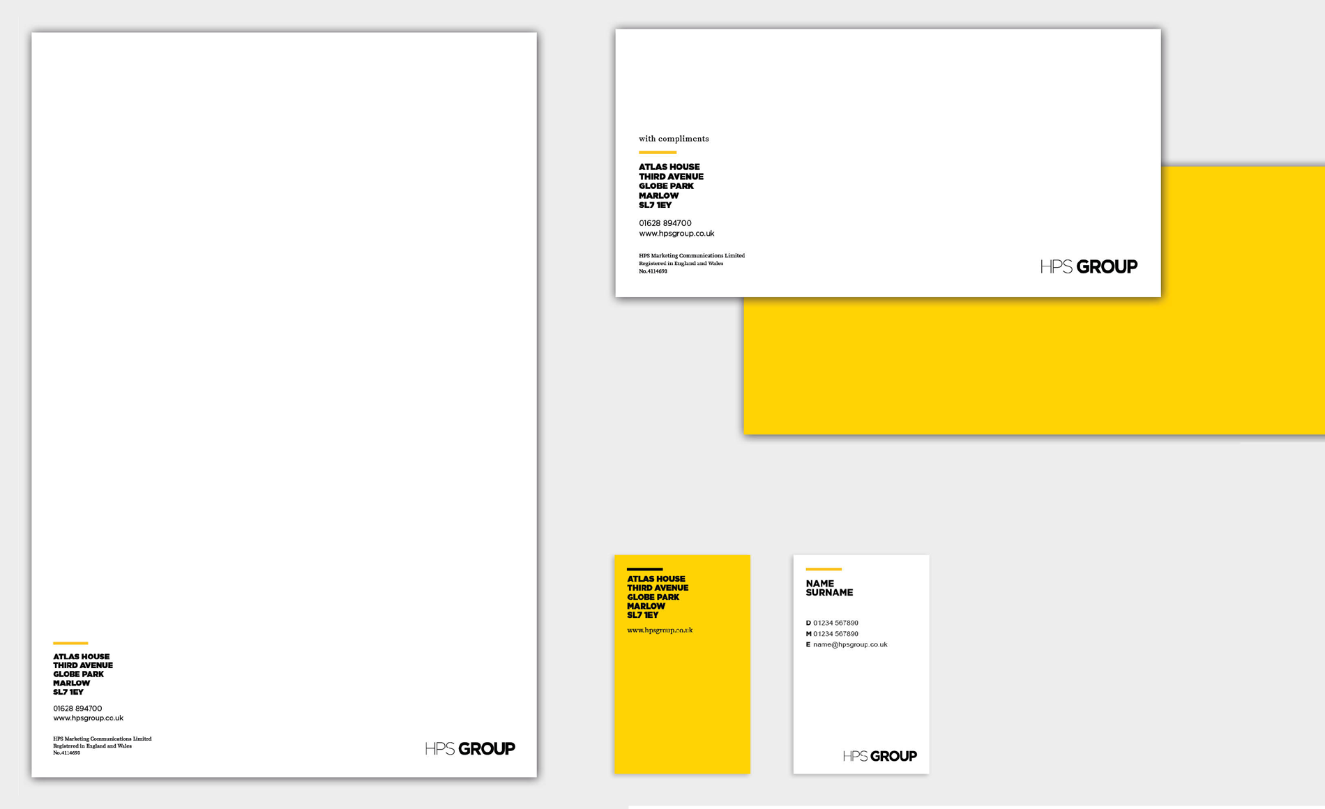
I managed and policed the usage of the brand and designed and created from signed-off creative concepts. I also created the guideline and designed all the group's stationery and in-office signage and graphics.
© Copyright Paula Williams 2020. All rights reserved.